The designers who want to build a website, for the first time, they make some mistakes. But, for the next time, you never make any mistakes and you correct the mistakes and solve it correctly. If you find out the mistakes, then you have never faced those problems. If you want to become a good web designer, then you have to restrict the mistakes and then the problems will never arise.
#1. Inactive Search Box:
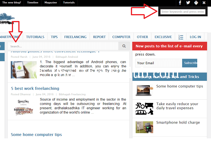
There is a search box on every website and in every blog. It means that if any visitors search anything on your website, then the visitors can find out their desired article from your website. Otherwise, they may go out from your site. Do not leave the search box unpractical. Then it is better not to keep it. You definitely keep the search box according to the color of the site, design and based on the content.
#2. Excessive Writing:
One thing always keep in your mind. Apart from the blogging type site, the visitors do not read others site. It is general matter. Suppose, you enter into a website and you don’t get your desired product and you get an opposite product. You search a product but you have watched so many articles which is not suitable to you. You must think that on which topic you build a website, you give the original information on that particular site and preciously. You must make the necessary lines, bold, italic etc.
#3. Font Size:
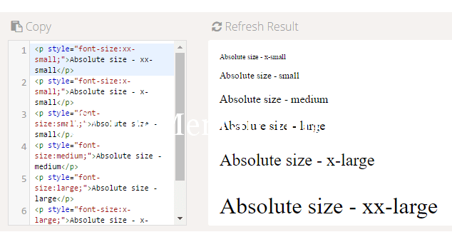
As a web designer, you have to keep in mind that your site will be read by so many types of people or various ages of people. So, you have to arrange the font size in such a way that all ages people get an advantage to read the article on your site. So, you have to keep the font size more than 12 or 12 and should keep the style as clear as possible.
#4. Lack of Correct Structure:
Most of the web designers face a problem to design a web. When a site is made for selling it, then you have to follow the correct structure. And the wrong design structure will take the visitors in reverse way. You concentrate on these subjects: a search box a beautiful and attractive navigation menu, clear the base of the sites, and keep an asking page (in where you have to give an attractive font) and give a picture where necessary.
#5. Additional Advertisement:
As an owner of the site, you have an ability to earn money from there. So, you do not forget the customer service. Suppose, you are a publisher of Google Adsense and from there you earn money. Here, you have to set the publisher’s advertisement in such a way that the customers do not bother you.
Before doing any work, you have to know about the mistakes. But, before facing any mistakes it will be better to learn it and keep yourself away from the mistakes.
It’s for today.
Thank You!


