


People’s thoughts and emotions are driven by colors, which play a crucial role in branding, marketing, and sales. When it comes to web design, colors provide directions or trigger call to actions on a website, which can affect traffic, leads, and conversions. In this post, you’ll learn about the psychology of color in web design.
What Is Color Psychology?
Color psychology is the study of how different colors affect human behavior, which is a facet of behavioral psychology. In marketing, it takes around one to two minutes for a customer to formulate an opinion upon seeing the color combination of a product packaging alone. This observation holds true for web design, wherein the decision of online users to stay in a site is also influenced by the color of the theme, font, and images.

In web design, the color should be used in the following:
- Backgrounds
- Borders
- Graphics
- Buttons
- Headline Type
- Pop-ups
Note: Talk to a trusted and reputable web design company, such as Chester County web design, to help you incorporate the best colors for your website.
What Are the Specific Colors Used in Web Design?
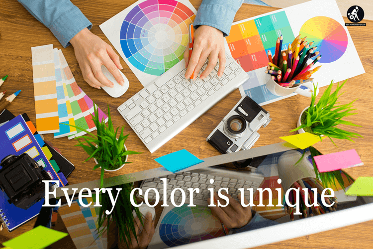
Every color is unique with a specific meaning and objective. The choice of color you apply to your website significantly impacts your site’s performance as it affects the perception, attitude, and behavior of visitors. Let’s dig more into the specifics of color psychology in web design.
- Blue
Many people like blue and it’s one of the most used colors because it symbolizes peace, order, trust, and loyalty. Typically, it denotes tranquility, trustworthiness, and security.
Here are some examples of websites that use blue as a primary color:
- Facebook: Blue highlights its core values, which are trust and transparency.
- Paypal: Blue enhances the company’s trustworthiness.
- Capital One: Blue depicts security and trust.
- Yellow
Yellow stimulates fun and excitement, so it’s a color of happiness and playfulness. Curiously, it’s also a color of warning, used for traffic signals, wet floor signs, and warning signs. Yellow is associated with childhood memories and pleasant experiences.
Here are some examples of how yellow is used in web design:
- Yellow is used by websites of fast-food establishments to reflect delicious food and a family-friendly ambiance.
- Use yellow sparingly, such as in call-to-action buttons, to encourage people to click on them.

- Green
Green is the color of nature. It signifies ‘the green effect’ or an environmental concept, such as a website promoting environmentally-friendly products or organic products. Green also improves creativity. It is a good color choice for a call to action when combined with the ‘Von Restorff effect‘ or isolation effect, which states that people easily remember things if they stand out. You can show your passion for environmental concerns or promote an environment-friendly or organic product using a green company logo, background, or images.
- Orange
Orange is normally used in children’s products and sports websites. Amazon used orange for its ‘limited time offer’ ad banner. Since it is a color that suggests urgency, orange makes a message more actionable. However, be mindful of how you use it as it may give off the impression of being cheap.
- Black
Black is the color of elegance, value, sophistication, and luxury. Many high-value products use black as a theme, such as Citizen Watch and Louis Vuitton. If you’re selling high-value items, black is an excellent choice.
How Do You Use Colors in Web Design?
The core principles of color psychology that can be applied to web design are the right audience, the right purpose, the right time, and the right way. Choosing the right colors in web design is crucial to attain desirable results, such as catching a customer’s attention, increasing traffic and conversions, and boosting sales.
Here are some tips and tricks to improve conversion using color psychology:
- Women like purple, green, and blue, so you can use these colors to enhance your e-commerce site’s appeal to female visitors. They don’t like orange, brown, and gray. Women prefer primary colors and tend to avert earthy tones.
- Men like the colors black, green, and blue. They don’t want brown, orange, and purple. If your site aims to target men, blue and black are favorite colors, which often depict masculinity.
- A call to action stands out when using bright primary and secondary colors, such as red, green, yellow, and orange.
- When it comes to conversion, brighter colors have higher rates of success than darker colors, such as purple, brown, dark gray, and black.
- Pink, yellow, green, red, and blue are the preferred colors for websites offering products for babies and children.
Conclusion
When choosing the best color for your website, you can also base your decision on the color you use in your product packaging, brand color or image. Applying color psychology in web design can go a long way as it has a direct influence on the behavior and perception of customers.


 – Bangla Typing Software Download")
")


")

Comments are closed.