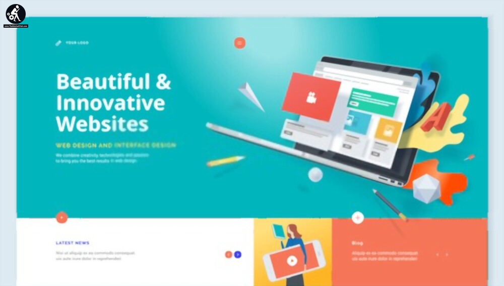
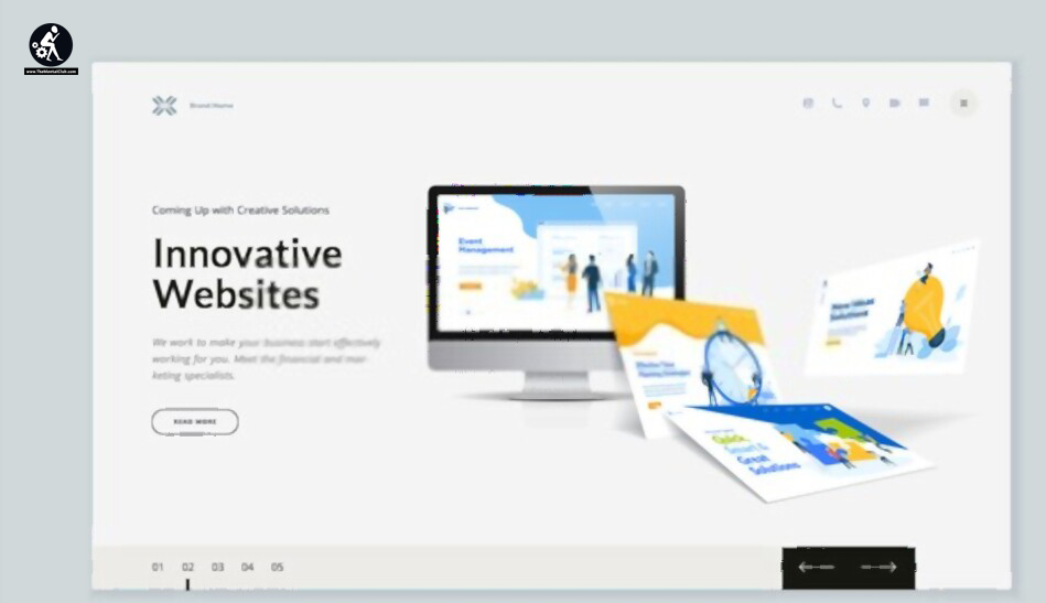
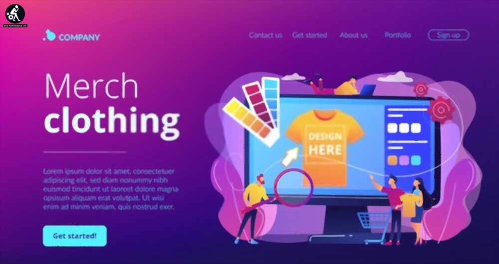
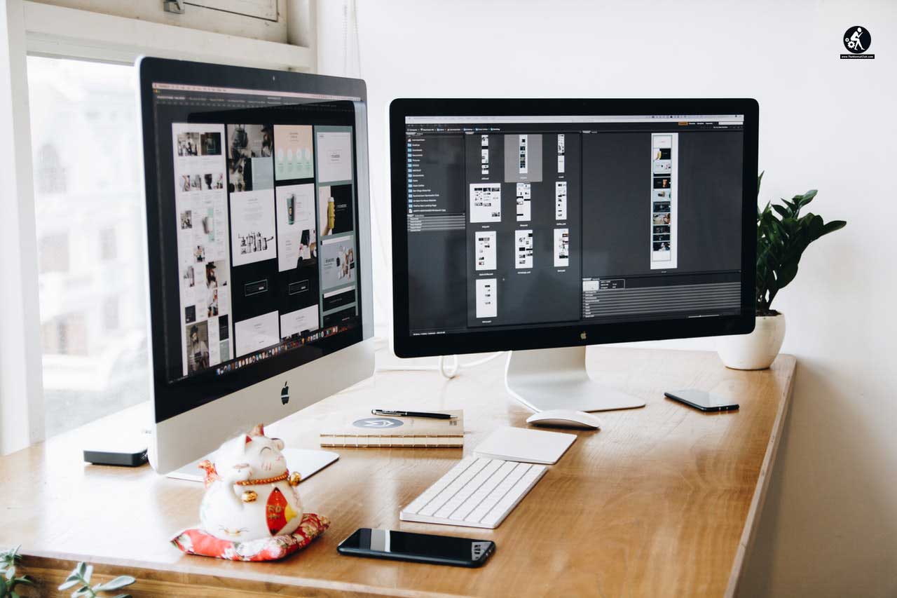
When you are a business owner, having a digital presence of your business is mandatory, and here the primary pillar is having a responsive business website.
Now the next question: How can we make our business website responsive and engaging?
Website responsiveness is primarily dependent upon website design. But creating a website with a generic design isn’t worth it nowadays. It is because millions of new websites follow this design and crush back
In this article, we are drooling over the technique through which you can avoid generic web design.
How to Avoid a Generic Website Design
Here we will discuss five methods to avoid a generic website design.

1. Go Bold but make a very clear design
First, you have to keep in mind that your website is the online representation of your business, it also plays a crucial role in branding. Your audience will remember you according to your unique web design and business logo. In this case, an expert web designer will help you to pick an absolutely perfect design ranging from Colour scheme to the insertion the element. Your website design speaks about your brand personality as well. Here Colour is very important because each colour reflects each emotion. When you choose font size and colours, it’ll be associated with a very serious yet professional tone about your business and organization. Thus font size also plays a subtle role in web design in modern days.
You can create various experiments to make a web design more authentic, but don’t forget to consider the psychology and identity of the web design. If you are not concentrating on human psychology and colour concepts, you are going the wrong way.

Take the help of a web designer who makes a website guide that has your preferable list of colour fonts, and iconography will be used on the site. This site functions as a great resource in future marketing campaigns in order to continue consistent brand authority and identity.
2. Focus on your web visitors
We often perform another common mistake which may lead to a very simple looking website that entirely focuses on the requirement and demand of the company, they do not listen, or understand the visitor’s demand. But for better response, your website should be engaging and fulfil audience requirements. Initially, at the beginning just consider your primary visitors and their requirements. This little thing helps you to customize everything about your website from design to the chatbox.

Web visitors only spend 12-30 seconds on the landing page of a website, thus you have a very short amount of time to convince them to stay further. Thus, creating a strong impression, a value proposition is mandatory to represent your brand in front of your audience.
Web designers always include all web-based value propositions to the homepage and it consists of a headline, subheadline, call to action at the first section of the landing page. AS most of the audience come to your website through the home page, the chat box area in this section becomes super effective to retain the audience into the page for longer.
3. Do invest in Custom design and imagery
If you apply a pre-made template as a website design, then it would be critical to make a website that stands out from the crowd as there are thousands of websites utilizing the same theme. Thus, we would recommend you to follow the custom design approach which is unique but easy to use. This unique and easy to use approach can deliver high-performing results in a stipulated time frame. Thus, it is recommended to enhance the quality of the site by customizing the image used in the website, as well as the iconography on your landing page as much as possible.

4. Find out the most suitable inspiration in a relevant field
It is a good idea to find the most appropriate example for your relevant field, it works as motivation. It will help you to go beyond the industry, and competition, and establish a new idea. Few industries do not have super class cutting-edge sites, so they choose third party technology-based design enrichment organizations for collaboration. You can take the help of different online resources such as Dribble, Aww wards which represents unique and updated web designers’ work.

5. You should add interactive components
Interactive components have become a mandatory option because it makes a balance between distraction and engagement. Please avoid too much movement to your landing page, because movements may distract the audience from getting the overall experience, ultimately it becomes annoying for visitors. Subsequently, they leave the webpage which drastically enhances the bounce rate.

Modern design best practices implement micro-animations and scroll animations which allow subtle movements and support visitors to scroll down the web pages easily. The best web development company in India always encourages to analyse web performance after making a particular design. You can fix a unique design after discussing the idea with a web developer to ensure the essential elements won’t interfere with the page loading time.


