The logo is a visual representation of your company’s activity. It helps current and potential customers to recognize you. A logo symbolizes your company’s values, improves credibility in the eyes of potential customers, and serves as a visual reminder for customers.

To develop a decent logo is sometimes enough basic set of tools, for example, free text logo maker and knowledge of your audience. In this short article, we’ll offer some tips for choosing your company logo.
If you just found your company
Don’t think about the look of the logo yet. Instead, ask yourself what you want to convey to the audience that will come across your business. Think about the words they would use to describe the use of your products or services: those words are the essence of your company.

As soon as you have those words or sensations, you can associate them with appearance. This initial part would be the starting point of the logo. It is important to create a list of company attributes to have a clear communication objective.
Let’s use a spa as an example. People go to the spa to relax and rejuvenate. The logo should convey these associations visually so that whoever sees it knows how they will have a good rest there.
Think of a few words associated with the concept of a spa. Just close your eyes and imagine that you are there, relaxing. What words best summarize that feeling? Calm? Tranquility? Relaxation?

Simple, no-frills design elements and word treatments would best represent those attributes. The lotus flower is a popular symbol for spas, as it is culturally associated with purity, beauty, and rebirth. It could be paired with a simple serif font to convey that sense of calm.
On the other hand, if you are a mechanic, what you would be interested in is conveying that you are a practical, hard-working, and reliable person. How would you visualize these qualities?
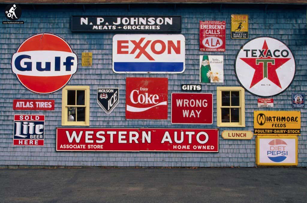
You could go for something vintage and rustic that includes tools of your trade, like a wrench or a can of lubricating oil. These visual cues convey that you get your hands dirty fixing cars. In addition, they are easy to recognize and associate with a service.
Use a color that makes the logo stand out
The subject of the typical emotional associations of colors is fascinating, especially since they differ between cultures. Many clients use black and blue, probably because many established companies use them, which is not surprising. Black is often used to express strength, sophistication, tradition, and confidence. Blue is usually associated with aptitude, trust, reliability, and security.

Look at the attributes you’ve noted and think about how you want customers to feel when they see your logo. Think about what you want it to convey and how color associations affect the message. Then think about the type of logo that best matches your company.
Familiarize yourself with different types of logos
There are three basic types of logos:
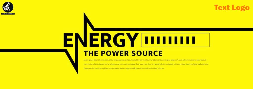
- A typographic logo is ideal if your company has an established reputation or uses last names. With a free text logo maker, you can get a good design in seconds.
- A monogram or initials is a visual image of the first letters of the company name. This combination offers a visual representation of the company and verbal recognition of the name.
- A symbol with words is usually a shape that gives a visual clue to a service or product. It would be the central part of the logo, which, combined with the company name, creates a recognizable and memorable appearance.

Think carefully about which logo is right for you. Do not be afraid to experiment and implement unusual at first glance ideas.


